
Japanese haiga still informs us today
Centuries-old Japanese haiga offer elements that can deepen our understanding of poetry comics today. Haiga often combine drawing with haiku, the now ubiquitous short poem form, delivered in the artist’s own hand. Foremost for me is the balance found in the words and drawings compositionally on the page.
There are many Japanese haiku and haiga masters; poet-painter Yosa Buson (1716-1784) is revered for excelling at both. One famous example of his haiga shows the poet resting at his writing table with an expression of blissful satisfaction. There’s a lot to admire here.
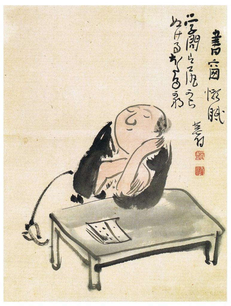
The brush drawing is (what we would call today) cartoon-like and signals the intended humor of the accompanying poem. (For a note on the translation, David LaSpina considers this particular haiku here: “Great learning, or great farting.”) What attracts me the most: The upper left third is blank, strategically balancing the haiku and the self-portrait. It gives space for contemplation for both the artist and the viewer, and space for the meaning to (literally) dissipate.
For me, this white space works the same way the gutter does between panels of a comic — it shifts time, action, perspective or even meaning.
On a personal note, I’ve practiced shodo, Japanese calligraphy, for more than 30 years, always aware of balancing the written characters with blank space on the page. I’ve learned to consider blank space an important element of composition. This pause gives the reader/viewer time to fill in the blanks (or gives room for a fart!), and becomes an integral third element with pictures and words.
P.S. More haiga by Buson and others can be seen here.
Timeline: Prehistory
Warning: This incomplete history maps my journey as a poet learning about comics and doesn’t follow a strict chronological order.
